You’ve spent a lot of time and money on your website. You’ve fussed over the layout, stressed over colors, even spent days experimenting with different fonts. The user interface is smooth, your store is easily searched, and you are finally open for business!
There’s just one problem. When you visit the ecommerce site on your phone it seems…off. The layout doesn’t fit on the smaller screen, you must scroll endlessly to find anything, and you’re constantly zooming in and out trying to read the inscrutable text. The pages are slow to load, and the whole experience is frustrating.
Where did you go wrong? What could you have done differently?
Logicblock has the answer, and it’s just three words long: Responsive Web Design.
What Is It?
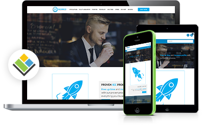
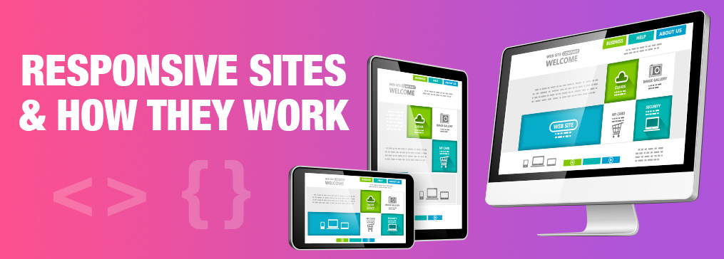
Responsive web design (sometimes RWD, or, simply “responsive design”) is a model of website creation that allows sites to be easily viewed on as many different devices as possible including smart phones, tablets, laptops, and even Smart TVs.
How Does It Work?
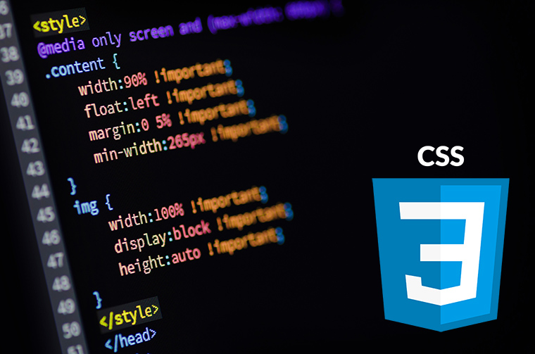
Responsive Web Design relies on the use of Cascading Style Sheets, more commonly known as CSS or CSS files. CSS is a programming language that tells your browser how a website should look, or “present” itself. Presentational information like font, text size, and color are stored in a CSS file, while the content of your page (maybe a blog post like this) is stored in HTML or a similar coding language.
When a customer visits your site, the CSS file associated with your web page tells your customer’s device how your page should look. Then another programing language like HTML fills in your content.
What Does That Mean for You?
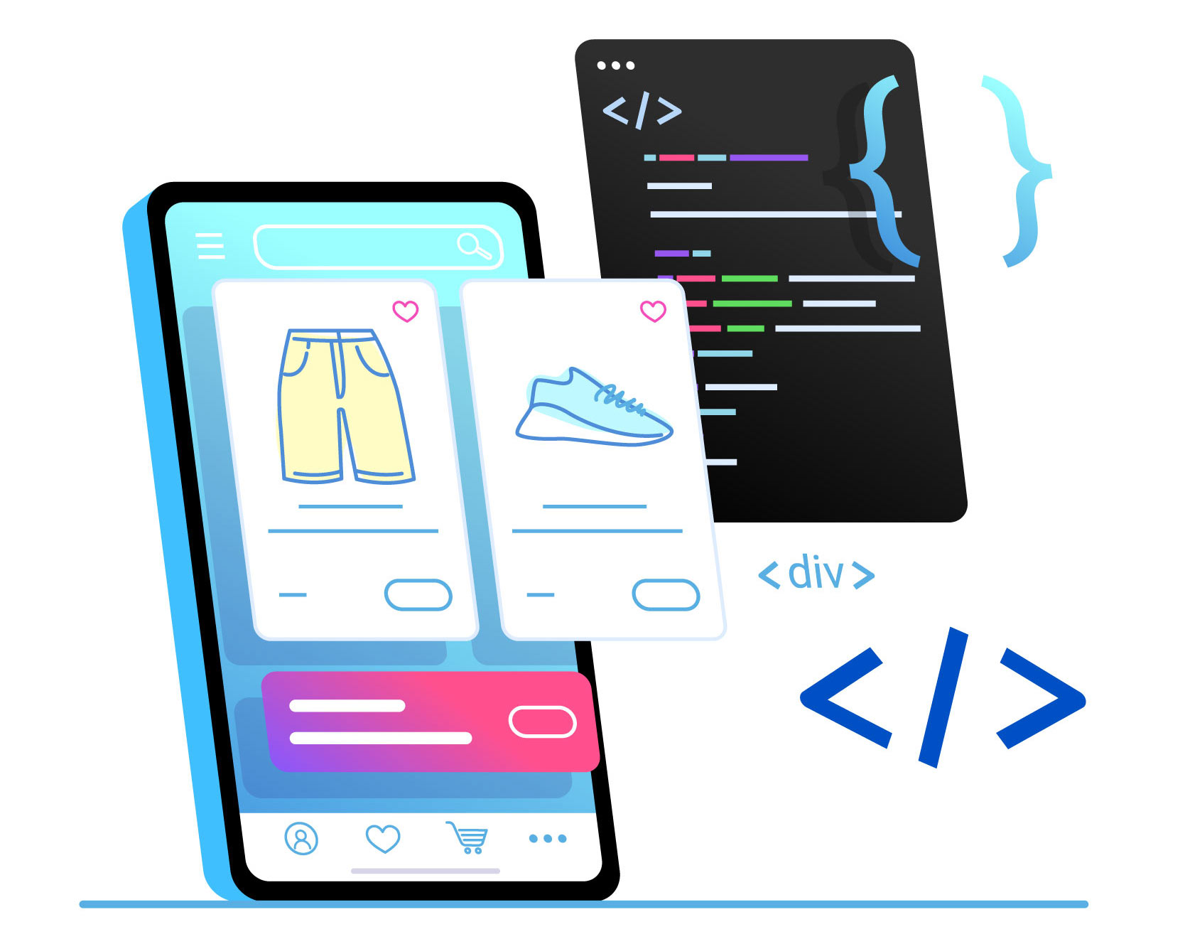
It means that creating new pages is simpler, because there is less coding to do. The same CSS file can be used for multiple pages.
It means faster load times, due to smaller file sizes.
And it means no matter what device your customer is using, your page always looks great.
Why Is RWD Important?
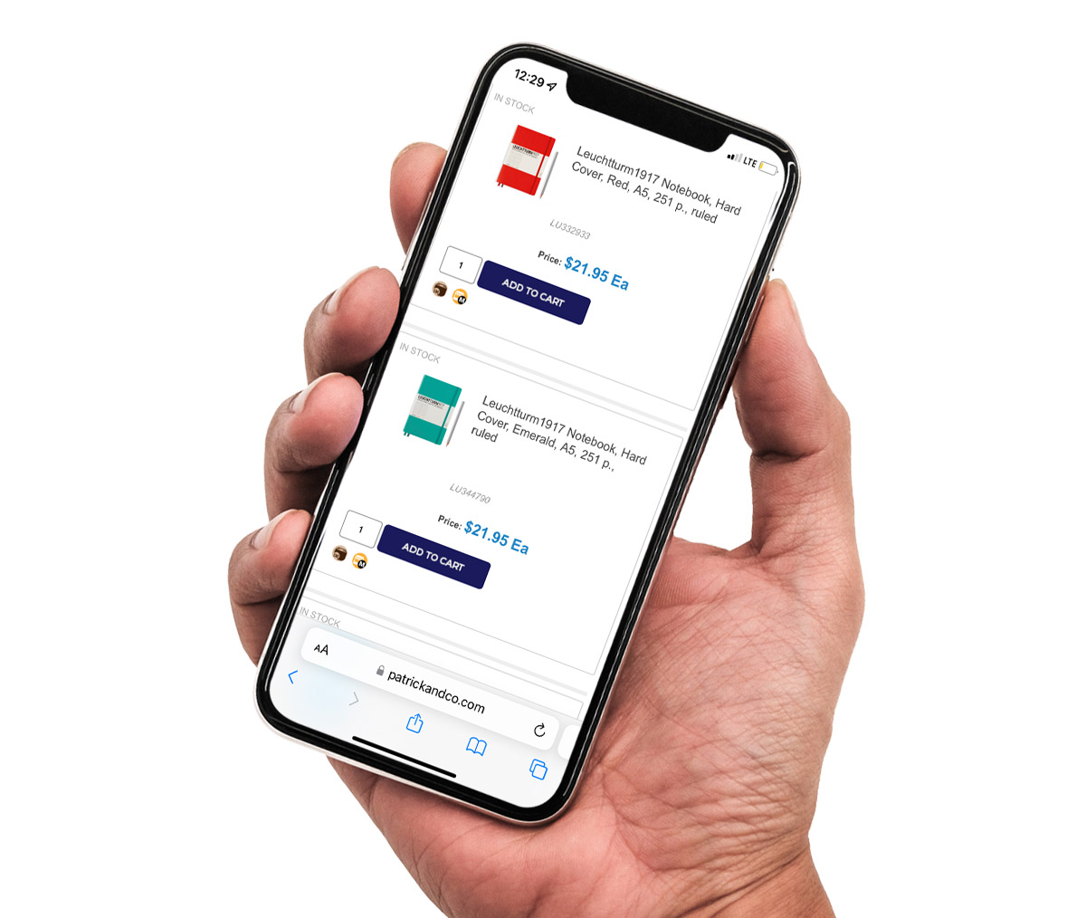
The modern office is everywhere, and deals are made in coffee shops, on trains, in planes, and every place in between. You want your customers to be able to reach your site wherever they are. Logicblock’s responsive websites automatically reformat to function on mobile devices. Being able to navigate your site on any device is important in and of itself, but the benefits of a responsive site don’t stop there.
Mobile-first Indexing
Since 2018, Google primarily uses the mobile version of websites for indexing and ranking. Previously, Google indexing focused on desktop versions of sites, but with the ever-increasing number of mobile users, it made sense to make the switch. In fact, in 2021 there were 4.32 billion unique mobile internet users. That means that worldwide over 90 percent of internet users primarily use a mobile device. If you want your website to create and maintain a high Google ranking, you’ll need a dynamic mobile website, and the fastest, most effective way to do that is with responsive design.
Cost Effectiveness
Without responsive design you’ll have to maintain multiple sites for mobile and non-mobile users, and that sort of inefficient redundancy will get pricey fast. Eliminate the cost of paying for additional sites by using RWD to maintain one site that works for everyone.
Flexibility
With responsive design, a change to your website is immediately reflected across all platforms. This flexibility is invaluable if you make regular additions to your website, want to tweak the design, or need to fix a small typo. Just make your change once, and its done.
Improved User Experience
Simply put, viewing a responsive website is a better experience. Eliminate zooming, scrolling, pinching in and out to read a sentence, etc. It all translates to ease of use and speed. The quicker and easier your mobile site is to navigate, the happier your customers will be.
The Benefits Are Clear
It should be obvious by now that a responsive site is a business necessity. With responsive web design, Logicblock makes it easy to create, maintain, and update your ecommerce site, so that your customers will always be able to find you.

