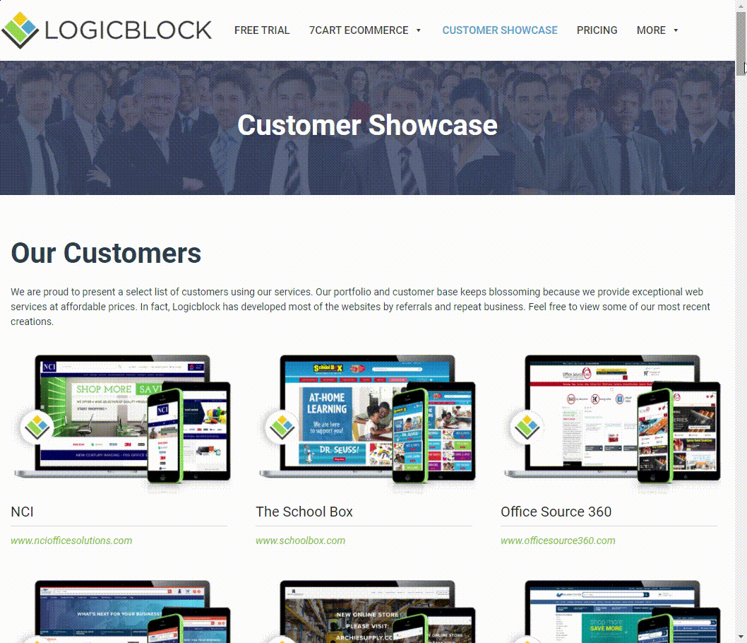
In the 21st century customers expect access to your site no matter where they are or what device they are using. Take the next step from Just Accessible and make your ecommerce site the most engaging spot on the internet! Grant customers powerful search functionality that goes beyond finger tapping and into the realms of sound and image.
How do you unlock this magic? Three simple words: Responsive Web Design.
With RWD, Your Site is Everywhere
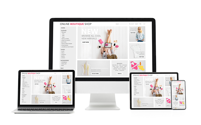
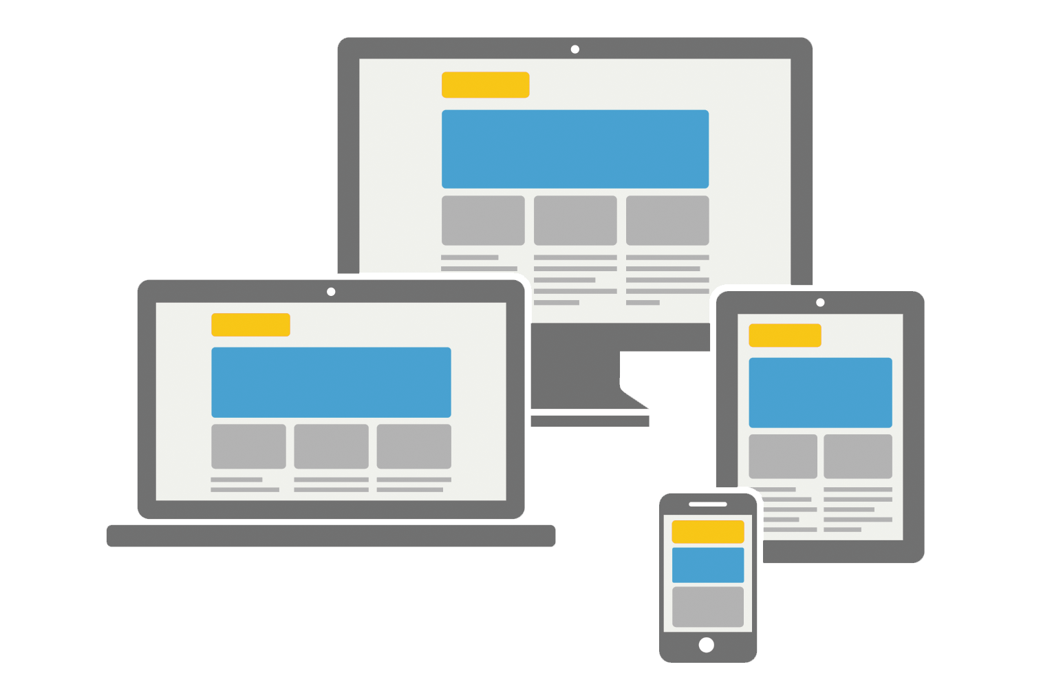
Responsive web design is an approach to web development that aims to create sites that provide an optimal experience across a wide range of devices and screen sizes. With responsive design, the layout and content of a website can automatically adapt and adjust to fit the screen size of:
- Desktops
- Laptops
- Tablets
- Smartphones
Responsive design eliminates the need for separate mobile versions of your store, and ensures that users have a consistent and seamless experience, no matter their device.
In a responsive website, elements such as text, images, and navigation menus will resize, reposition, or even hide themselves to accommodate different screen sizes. This ensures that users can easily read and interact with the content without having to zoom in, scroll horizontally, or encounter any usability issues.
Ultimately, RWD means an enjoyable experience that’ll have your customers coming back for more.
How RWD Works For You
In addition to an enhanced user experience for customers, RWD unlocks very real benefits for your business.
Simplified Maintenance
Responsive design eliminates the need for maintaining multiple versions of the website, reducing the overall maintenance effort. Updates, content additions, and design changes only need to be implemented once, ensuring consistency across all devices.
Increased Reach
More than 85% of American adults report daily use of a smart device. RWD provides a smooth experience on any device, extending your reach to millions of potential customers.
Improved SEO Performance
Search engines like Google prioritize mobile-friendly websites in their rankings. Higher visibility in search results leads to increased organic traffic and, ultimately, more potential customers visiting the retailer’s website.
Better Conversion Rates
When customers can easily browse your catalog, view details, add items to their cart, and complete the checkout process on any device without obstacles, they are more likely to make a purchase. It really is as simple as that!
Audio Searches

By implementing responsive web design principles, you can enhance your website’s compatibility with voice search and provide a seamless user experience for users who rely on audio interactions. This, in turn, increases the visibility and accessibility of your website in the context of audio searches, potentially driving more organic traffic and engagement. Here’s how responsive design can help:
Improved Voice Search Compatibility
Voice searches often come in the form of conversational queries, where users ask questions or provide more natural language input. Responsive design helps to optimize your website’s content structure, ensuring that it is compatible with voice search queries.
Structured Data Markup
Structured data markup is a way of providing additional context and information to search engines about your website’s content. This markup can be particularly helpful for voice search as it allows search engines to understand and present your information more effectively.
Quick Loading Time
Speed is crucial for providing a good user experience, and responsive design ensures that your website loads quickly and efficiently on mobile devices. Fast-loading pages are more likely to be favored by voice search algorithms, resulting in better visibility and user engagement.
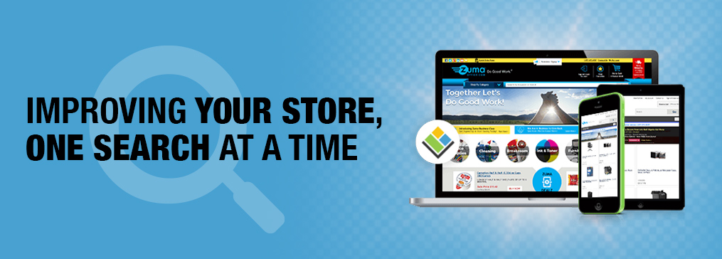
Visual Searches

By implementing responsive web design techniques, you can increase the visibility and accessibility of your images in visual search results. This leads to improved organic traffic, engagement, and conversions related to visual searches.
Clear and Relevant Image Metadata
Metadata, such as image alt text, captions, and descriptions, provides additional context and information about your images to search engines. Responsive design allows you to optimize and display this metadata consistently across devices. By ensuring that your image metadata is descriptive, accurate, and relevant, you increase the chances of your images being properly indexed and surfaced in visual search results.
Structured Data Markup for Images
Implementing structured data markup specifically designed for images can enhance the understanding of your visual content by search engines. Responsive design allows you to incorporate this markup into your website’s code in a structured and organized manner. Structured data markup helps search engines interpret and present your images more effectively in visual search results, increasing their visibility and attracting relevant user attention.
Responsive Image Galleries and Grids
If your website includes image galleries or grids, responsive design ensures that these elements adapt to different screen sizes. This means that users can easily browse and interact with your visual content, regardless of the device they are using. A well-designed responsive image gallery or grid improves the overall visual search experience, enabling users to explore and discover relevant images more effectively.
Image Optimization
Visual searches rely on analyzing images to understand and provide relevant search results. Responsive design ensures that images on your website are optimized for different screen sizes and resolutions. By properly scaling and compressing images, you can maintain their visual quality while reducing file size, resulting in faster load times and improved user experience. Optimized images also help search engines analyze and index your visual content more efficiently.